


Utah saw more new cases in the last week than at any other time since the coronavirus pandemic began, with a rolling 7-day average above 1,000 for the first time.
Utah County has had higher rates of newly reported infections for over a month. That means they had more cases per 100,000 residents. But two weeks ago, Utah County passed Salt Lake County in terms of the sheer number of new cases. That’s despite Salt Lake County having 1.15 million residents compared to Utah County’s 651,000.
Utah County had 2,498 cases from September 15-21 compared to Salt Lake County’s 2,198. From September 22-28, Utah County had 2,964 cases compared with Salt Lake County’s 2,626.
In both weeks, Salt Lake County was recording its highest numbers of positive tests, making Utah County’s numbers that much more notable.
The story above looks at Utah County in more depth along with a look at the role of Brigham Young University and the University of Utah in the spikes.
The chart below shows every county that had at least one case of COVID-19 reported from September 22-28. The numbers represent the number of cases per 100,000 residents — the best way to fairly compare the rates between counties with far different populations.

This next chart compares the rates of Utah’s 10 medium-sized counties. We call them the “10 over 20,” because each county has more than 20,000 residents (but less than 100,000).

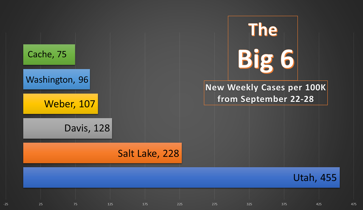
The next chart shows the rate per 100,000 for Utah’s “Big 6” counties. They are the six counties with populations exceeding 100,000.
Because the Big 6 have enough people to make other statistics more meaningful, we also compare them to themselves each week with a “Big 6 Bounce” chart. The numbers in the chart below represent whether the county had a higher or lower infection rate from the previous week. Low numbers are good. It’s important for this chart to remember the number is about the improvement or decline of each county. For example: the negative 105 number for Cache County is fantastic, but they could only have such a low number because it had an extremely high number the previous week (180 cases per 100,000).
