So, I tend to geek out, obsess, uber-focus, tunnel vision, crawl into Excel and say goodbye to the world.
On days like this, I make charts from spreadsheets so I can comprehend what happened on days like Super Tuesday.
These charts don’t really tell a story about Bernie or Joe, or Donald (Mr. President) and Bill.
They tell a story about Utah’s population and relative interest in our last two Presidential Primaries spread across 12 years.
To clarify, Utah held caucuses in between. Apples and oranges. Not a good comparison.
The 2008-2020 comparison has problems as well. Republicans didn’t really have a big competition. Also, 2020’s vote by mail will make future comparisons more apple to apple.
So…the charts:
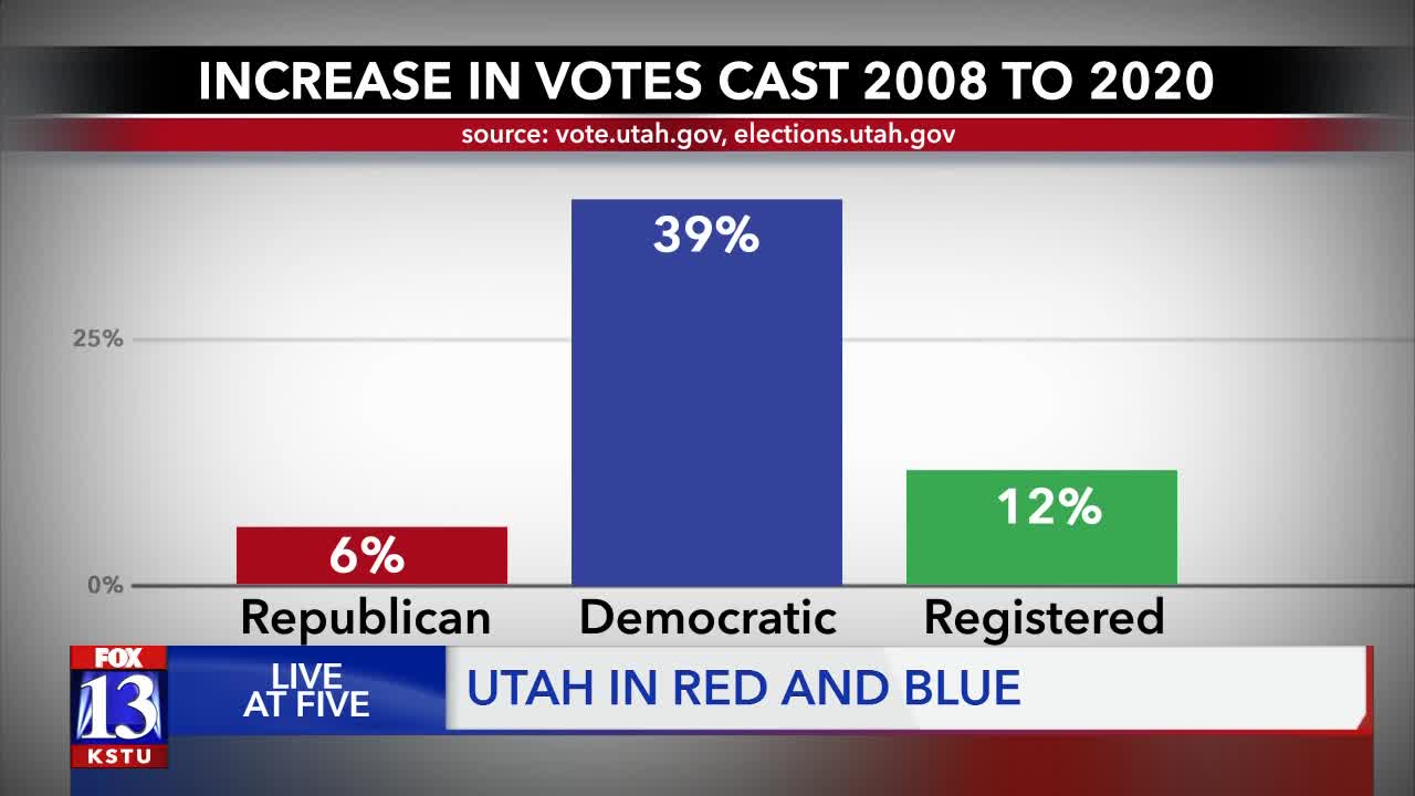
#1 shows the raw numbers. They’re up, clearly.
#2 shows Utah has 12% more active registered voters in 2020, so Republicans actually voted at a lower rate in 2020. (Makes sense. They have an incumbent president with very little opposition in the party.) The Democrats showed a dramatic increase in interest. This is especially significant because Barack Obama and Hillary Clinton were battling for the nod in 2008—not exactly a ho-hum primary year. Was it millions in advertising, excitement for particular candidates, or antipathy to President Trump fueling the surge? Could be all of the above.
#3 and #4 These graphs show Democrats went from 31 percent to 37 percent of the vote.
#5: This shows the growing blue island in a red sea Utah has become. The most populous county cast only 44 percent of it’s votes in the Republican Primary. Of course that means 56 percent voted in the Democratic Primary (hey, math!). Summit and Grand Counties are similarly light blue, while the rest of the state is varying shades of Republican Red. By the way, as a born-and-raised Weber County kid I feel much shame the numbers got cut off there. 65 percent of Weber County voters cast ballots for Republicans. 86 percent of Morgan County voters did the same.


